5 design principles I revisited while teaching university students
Table of Contents
[ show ]- Loading table of contents...
Patrick Cusack
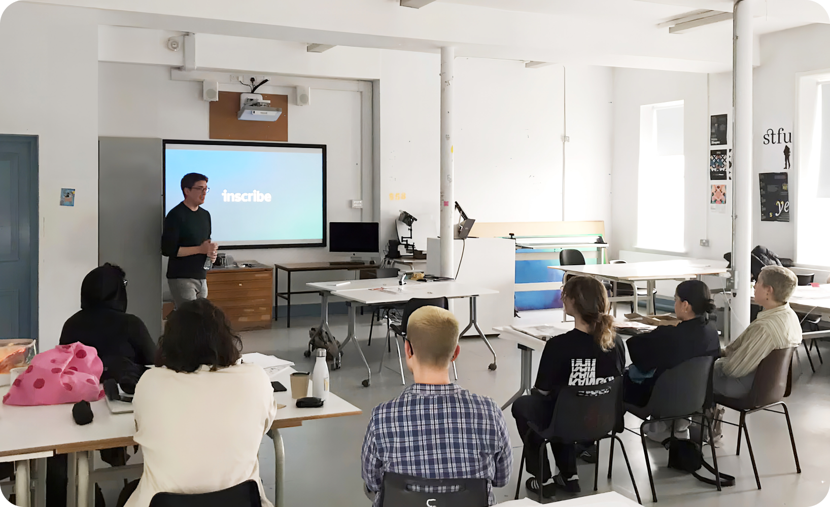
So many design students graduate and enter the workforce without much relevant exposure, experience, or understanding of the UX field.
In fact, that was my lived experience. I studied graphic design at the Limerick School of Art & Design (which is now part of the Technological University of the Shannon in Ireland), then began my career at a brand agency. It was there that I discovered my love for all things digital. It was this passion that made me return to school and earn my master's degree in interactive media and pursue a career in the UX world.
Now, some 15 years after my own graduation, my love of the field, combined with a lack of formal UX coursework, made me want to introduce more students to UX and help them launch careers of their own. Working with my friend and former mentor Joe Lane, a long-time Lecturer in Graphic Design Communication at my alma mater, we developed and launched a secondary project for fourth-year design students that would have them research, prototype, and test a UX project that tackles a real-world issue, like increasing voter turnout in Ireland or helping a local museum catalog a recently acquired collection of posters.
Initially, the program was intended to give students hands-on experience with UX design and help them understand the role this discipline plays in solving problems and changing behaviors. But now, five years into the program, I recognize that working with these students has reminded me of a few things too – and reinforced so many of the design principles that provide the foundation for every project. Here are five of my biggest takeaways from working with students at the Limerick School of Art & Design.
5 enduring design principles for UX
1. To solve a problem, you need to understand it – from the user's point of view.
An essential part of product and experience design is that the designer must fully and completely understand the problem in order to solve it. That means considering the issue from the point of view of your end-users, who may not be digital natives or even very comfortable with technology.
Our project at the school kicks off with a day-long studio session to review the brief. Joe and I introduce the problem to the students and help them build awareness of the issues and challenges — be it through conducting competitive research, field interviews, surveys or any other relevant methods. With that foundation in place, we then help students develop and test a prototype of their solution over the next two or three months.
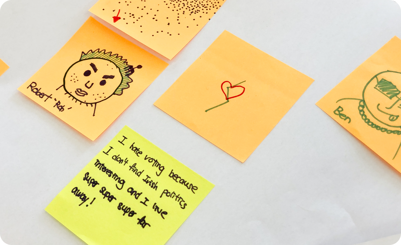
One of the interesting things about working in a studio setting with a large group of students is that there is no shortage of ideas for how to solve the problem at hand. For example, in our first brief, we asked students to design an online voting app where users could rank their choices in order of preference. That may sound like a straightforward task, but as the groups found out, there were many ways to approach the challenge. Some teams presented users with an empty list, requiring users to tap an empty slot and select a candidate and repeat the process for all available slots.
That's great — but what happens if a user wants to change their ranking? Other students implemented a drag and drop system that allowed users to rearrange the order of the candidates as they go. Some of the most successful projects included a brief training component to help users understand how to use the tool. In this way, the students were encountering and solving for common design challenges like user onboarding in real time.
2. Great UX is more than just aesthetics.
When some students think of UX design, they are often focused on how the product or experience looks. But how it works is equally as important.
Another big part of our program is about helping students understand how to determine if the prototype they developed works – and what that even means in objective terms! When I workshop with students, I ask them to consider how well the project covers off on these three categories:
- Scalability: Is the solution narrowly focused, or can it be adapted and redeployed to reach more users?
- Systemic: Does the solution solve the problem, or just a symptom of it?
- Measurable: Can you measure the impact of the solution, and how did you arrive at the metrics you use to define success?
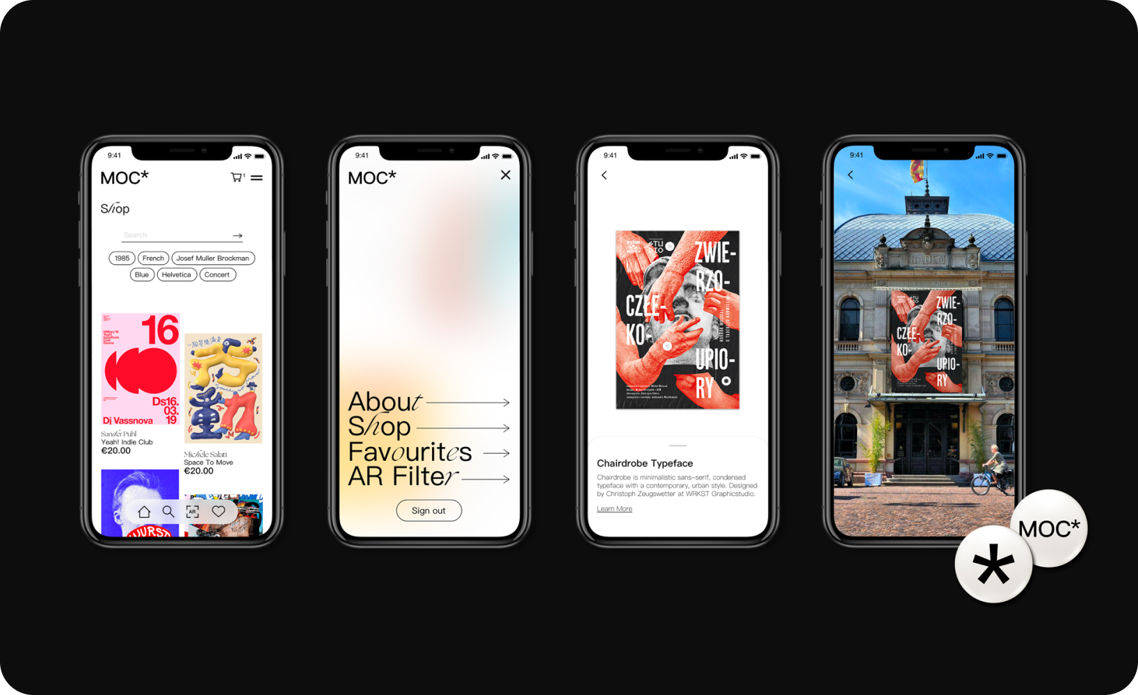
For example, the second brief, Joe and I presented to the students was a digital archiving project that would help the Limerick City Gallery of Art manage a donation from The Michael O'Connor Poster Collection. The collection features 2,800 international posters of historical and cultural significance, mostly from plays, movies and other events. Since the collection was so large, the gallery could not display them all, so students were tasked with developing a digital experience that would help solve that problem.
Again, there were many ways students were able to approach the project. Some chose to design a digital companion experience to expand and enhance a physical gallery visit. Another group added an element to the digital experience that allowed users to view the poster in the context it was originally designed for. Throughout the design period, we consistently returned to the three categories of scalability, systemic change and measurable impact, helping the students understand that their design needs to do more than just look good.
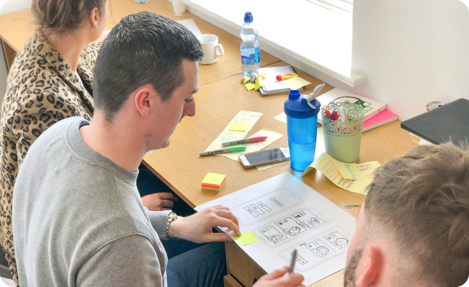
3. A successful product or experience is a result of constant iteration and improvement.
One of the best parts of being a product designer is that our work is iterative. We get to constantly improve the experience by studying the existing design's performance, gathering feedback, and releasing further updates.
This is especially true if you work on an in-house team, as internal designers often have more time to work on deep projects and see them through from beginning to end. In fact, one of the things that really appealed to me about my new role at Inscribe is the opportunity to partner closely with engineers to refine and iterate on the digital product and experience we deliver to clients.
I try to impart this idea on our students as well. A successful project, within the context of our program, is not just to produce a working prototype. It's developing the rigor and discipline to continuously improve the current version so that the product or experience keeps getting better over time. I believe that it's this pursuit of improvement that makes a great designer more than any other skill or trait.
4. Sometimes, it's about the moves you don't make.
Building a clear digital experience can be a little bit like jazz: Sometimes it's the notes you don't play that matter most. What I mean by that is, while the final product delivered to the client should offer a clear and logical journey, there were likely some trade-offs or key decisions made along the way that should be documented and explained so that the rest of the team understands how the experience was formed and why.
Personally, I find the thinking behind the experience to be one of the most interesting aspects of the student projects. I like to review the things that students tried that didn't work, their understanding of why that approach came up short, and what they might have tried in response. Getting into the habit of working this way ensures that you anticipate questions, consider the project from all angles, and helps build a deeper understanding of the problem you are trying to solve.
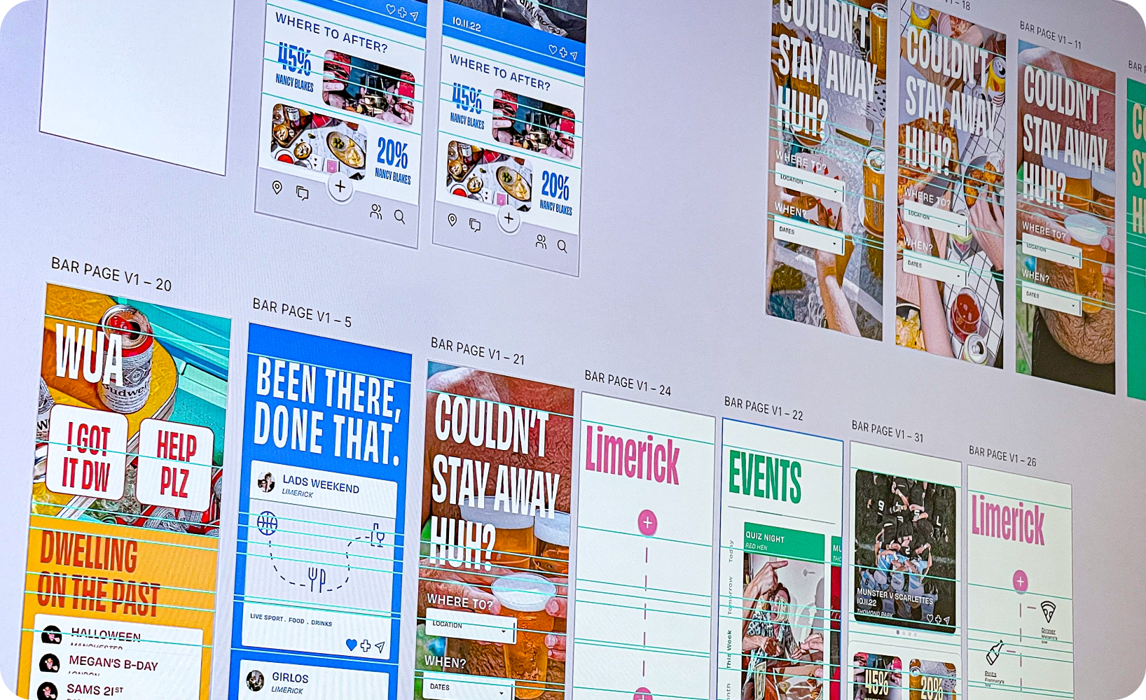
This was an especially interesting point in the latest brief, which was far more open-ended than the first two projects Joe and I assigned the class. In this latest course, we asked students to design a digital experience that enhances a user's connection to a place. We saw a variety of interpretations of what that experience could entail, from generative art pieces being made in response to a person's walking route, to themed tours to introduce visitors to new city or town or help long-time residents learn more about the history, to crafting a perfect night out with friends. I really enjoyed seeing the many different ideas that came out of this project and I think it illustrated the world of possibility – the full breadth and depth of experience design – to the students.
5. The moment of truth: User testing. (Not exactly.)
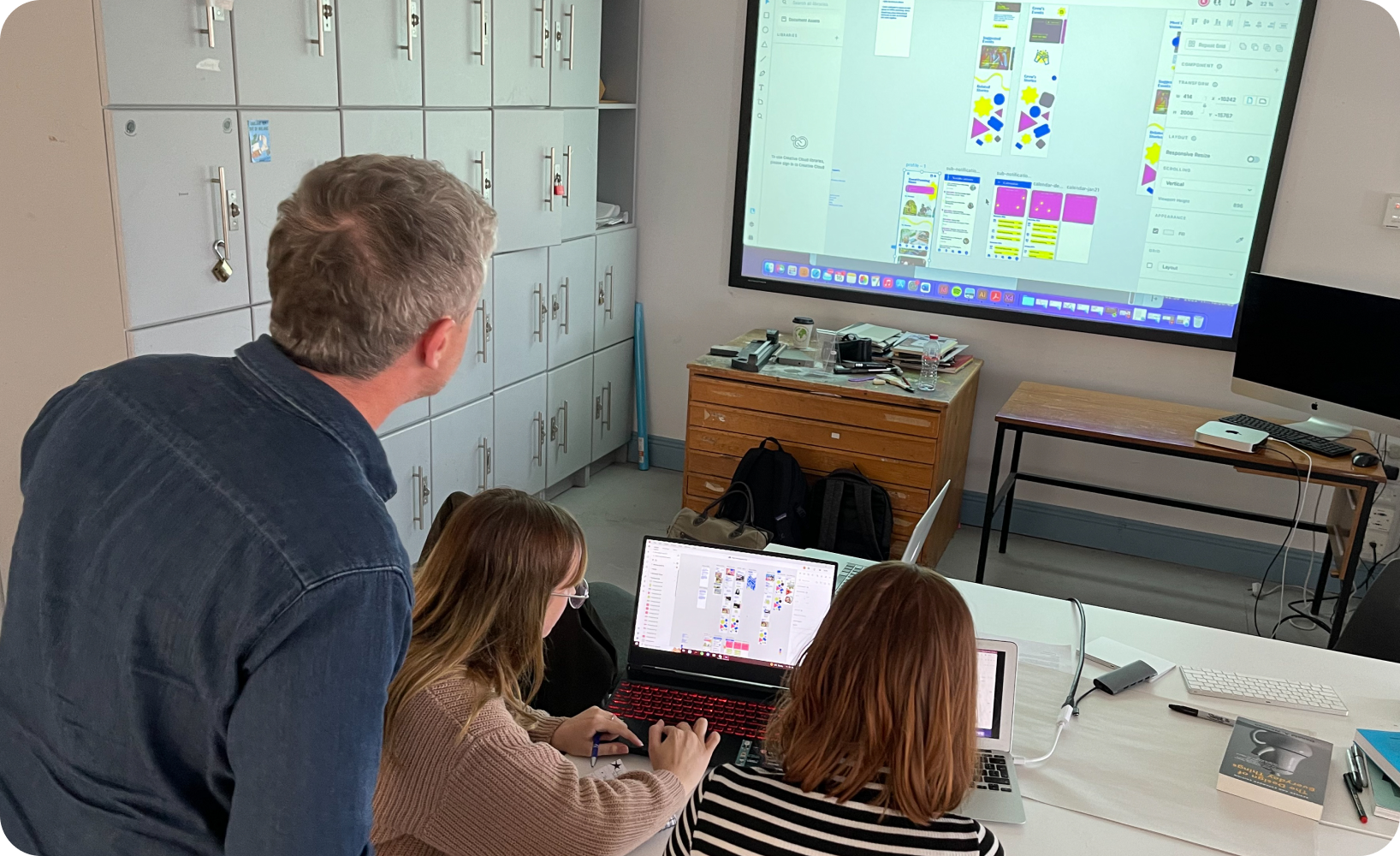
Another aspect of the program that Joe and I implemented was a mandatory user test. In an ideal world, this step would validate the original project assumptions and determine if the user has the same shared understanding of the project as the designers.
This step not only ensures that the project has real-world value, but also reinforces the points about iteration and continuous improvement. When you're deep in the detail of a project, it can be easy to assume that people will know how the experience works – but that's not always the case. At the same time, a failed user test doesn't mean that the project has failed; it means that it needs further refinement. And, to be clear, even if the user test goes well, it's likely that it will uncover feedback that can further improve the program.
Designing for now and the future
A UX designer is a builder. We create things that move society forward. This is one of our core values at Inscribe – and it can be true for any UX designer, whether they're a student helping a museum archive posters or a senior designer at a company like ours that is helping to create a more fair and efficient financial services ecosystem. As a designer, I'm proud to support this mission – and help inspire the next generation of builders to do the same.
Interested in joining Inscribe's team of builders? Check out our job postings today and learn more about the exciting opportunities our company has in helping rebuild the financial system so that it works better for everyone.
About the author
Patrick Cusack is the Staff Product Designer at Inscribe, where he leads the design process from research through to delivery. With over 15 years of experience in product design, Patrick brings a strong focus on crafting intuitive and impactful user experiences. He is also a guest lecturer at the Limerick School of Art and Design, where he introduces students to UX design principles. Outside of work, Patrick explores creative passions such as interactive visuals and the integration of generative AI in design. Based in Dublin, Patrick continues to push the boundaries of design and innovation.
What will our AI Agents find in your documents?
Start your free trial to catch more fraud, faster.


